Right from the start I was excited about creating the artwork for the cabinet. One issue with artwork and design, however, is that I’m normally so full of ideas for things that I take ages deciding on what design I want. There are so many ways I could go. A dark theme, a light theme, recreating a proper cabinet, making it quirky etc. I ended up choosing to brand it as Retromash, which seemed fitting, and my Retromash branding has always incorporated the kind of off-white that you found a lot in the 80s on things like NES, SNES, Game Boy, Tomytronic 3D Thundering Turbos and Raleigh Vektars etc. I liked the idea of going for a light theme as I thought it would stand out more.
I always wanted to create my own art and I wanted some cool way to make a montage of old arcade art. I originally thought I could source some actual game artwork, such as the sideart for games like Space Invaders, Golden Axe, Gauntlet etc and make a montage out of them. But it quickly seemed like that would be a lot of work and I wasn’t sure how good it would look. I instead chose to use sprite artwork from a bunch of arcade games and make them into a montage instead.
One of the challenges with using sprite artwork is that you can’t really find it as scalable vector art. You could certainly recreate your own for simple games like Space Invaders but when you get to more complex graphics like Out Run, Rampage or Street Fighter 2 that would be a lot more work. One of the other issues with sourcing sprite artwork is that if you look on Google images a lot of the screenshots of games are saved as JPGs and are compressed which means the images won’t be sharp and you can’t lift the sprites off them. You either have to find ones that are sharp GIFs or PNGs, or you have to capture your own screenshots using MAME. My MAME wasn’t working on my computer so that wasn’t an option for me. The other option was to hunt for sprite sheets online. I found two great websites, Spriter’s Resource and Sprite Database that had sprite sheets of a lot of the games I wanted. I then chose the particular sprite pose I wanted and in Photoshop I changed the image mode to Indexed, which means you can scale it up and it won’t get pixelated or aliased. Once I enlarged it to the size I wanted (pretty big) I then changed it back to RGB mode and then removed the sprite from its background and saved it as a transparent PNG and brought it into my master document. Thanks to Sam Dyer from Bitmap Books for sharing his experience in scaling up pixel art for his incredible books with me. As a side note you seriously have to check out his books. They’re beautiful.
Here are some of the sprite sheets I found.
![]()
I had a list of about 25 games that I wanted to incorporate into the artwork but I wasn’t able to find clean sprites for them all. I got about 15 from the sprite websites I mentioned and a few I managed to find as clean GIFs on Google images. There were a few others that I definitely had to get hold of though and I had to ask for help on Twitter. Rob Norton @Robster_N stepped up to the plate and, the legend that he is, he proceeded to play the games I requested and get screenshots of the particular shots I wanted. And I was quite particular and fussy with the poses I was after too. I’m hugely grateful to him for taking the time out to do that.
I was pretty happy with all the artwork I had gathered. My only slight gripe was that I hadn’t been able to find a particular shot from WWF Superstars. It’s the one where The Ultimate Warrior is gorilla pressing Hulk Hogan above his head. I managed to get one of a part of that animation but it wasn’t the final step in the animation where the Warrior has his head back and looks like he’s shouting. The only crisp image I could find was the one from a frame before that in the animation cycle, and it was much harder to ask someone to screenshot that frame as it probably only lasts for a split second in the game.
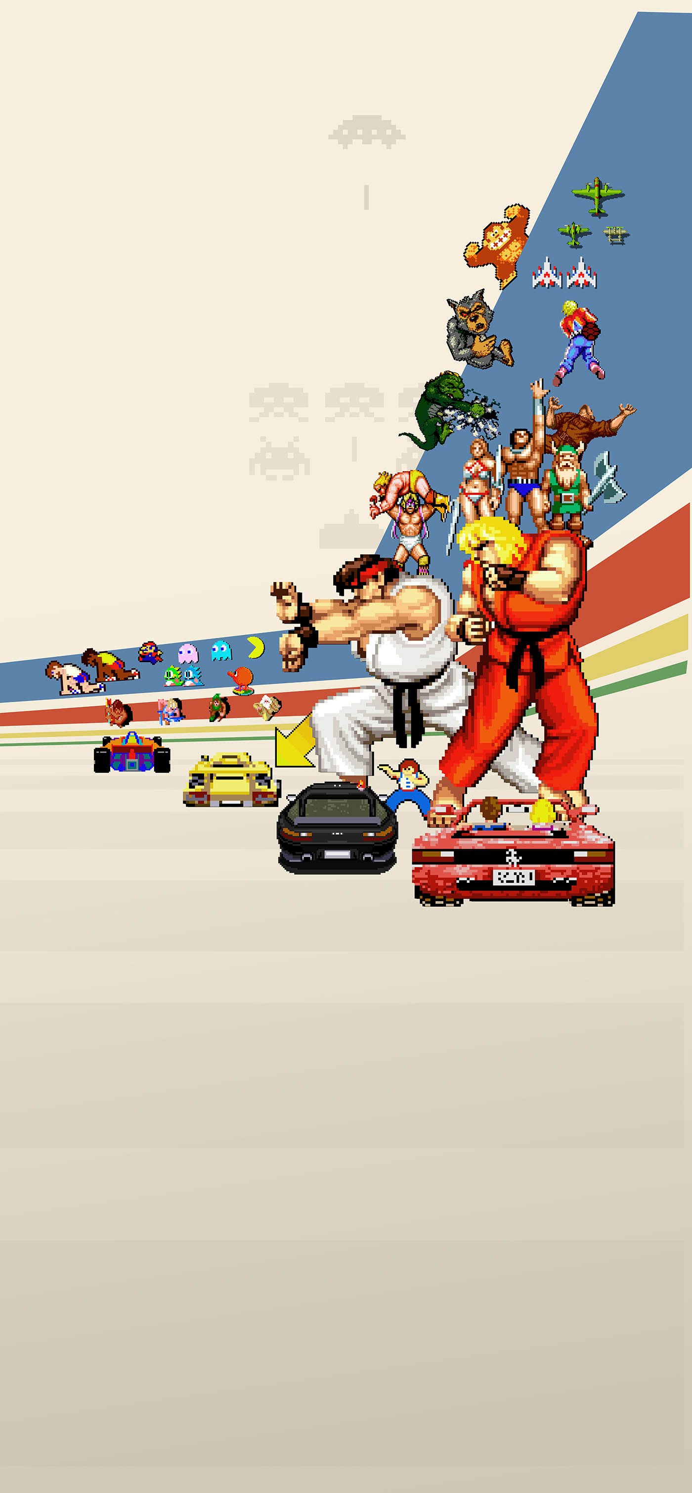
I didn’t really have a clear idea of what sort of montage I wanted so I just waited until I got all the images I could and then brought them into Photoshop to see what happened. I gravitated right away to having the two Street Fighter characters as the main focal point of the piece. I just love those images and felt the Hadouken pose would be great to have large. I knew I couldn’t fill the whole side easily with graphics so I chose to leave a lot of it as the off-white colour but I knew I needed some other kind of pattern or graphical lines. I played around for a while but finally settled on the blue and red lines in the style which kind of reminded me of things like Track & Field, The Last Starfighter, and the Atari logo. I played around with all the other sprites and went for a logical approach of having the cars near the bottom and the flying sprites in the sky etc. The simpler graphics of Space Invaders didn’t really sit that well with the other graphics so I chose to put them as a kind of watermarked back layer and have them against the off-white colour. Works quite well I think. And to break up the bottom section a little bit I added some stripes, which kind of reminded me of games like Space Harrier or Overlander. Once I had one side done I just had to flip the image to make the other side. I think the only sprite I had to flip again was the Out Run sprite as the horse in the Ferrari logo was facing the wrong way.
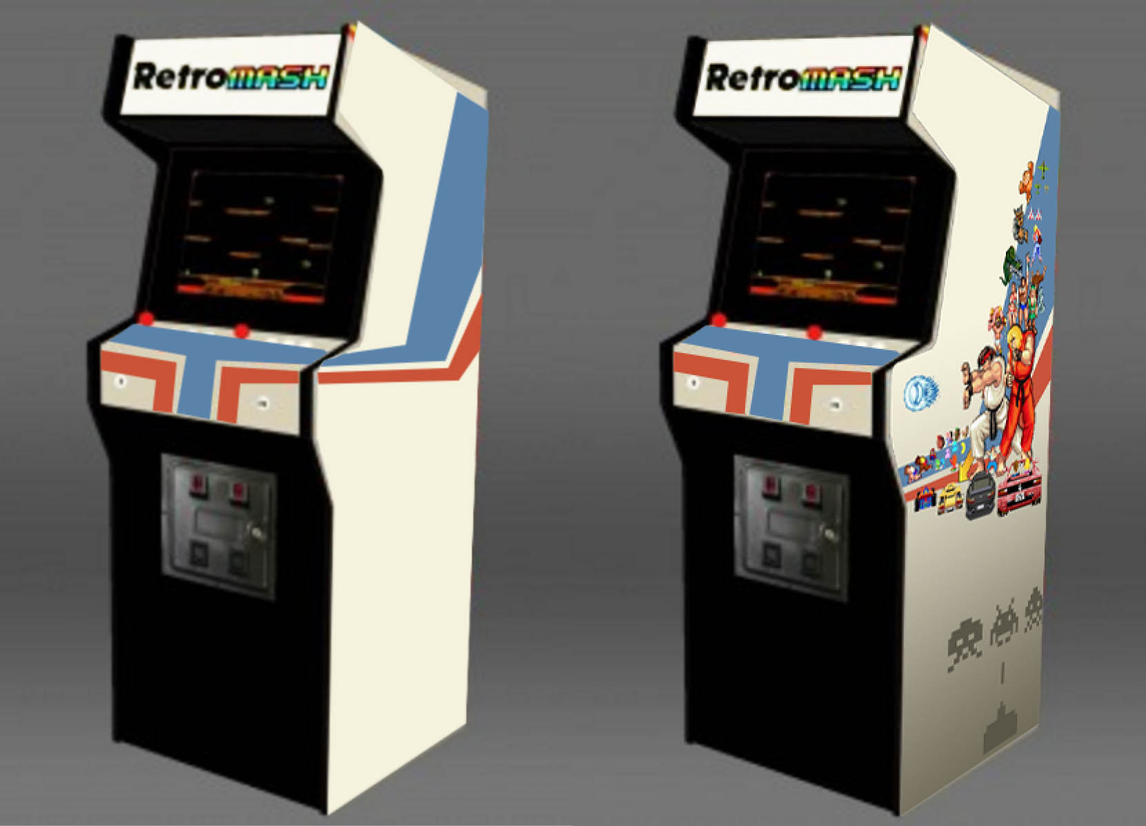
I needed to envisage how it would look on the final machine so I did a couple of really rough mockups to try to get an impression of how the colours and also the layout of the side art would look.

And here are the final side art images I sent to the printers.

The side art all happened fairly easily after I got into it, but I really struggled with the control panel art. I knew it might be quite hard lining it up exactly with the buttons and joysticks so I didn’t want to make something that had to be millimetre perfect with shapes around the buttons or text that pointed to joysticks etc. I wanted something more forgiving and less complicated. I also knew I wanted some part of the design to flow over the curve as this would really highlight the curved edge that I had felt strongly about adding. After much agonising I chose to go for a continuation of the blue and red stripes from the side art. I thought about having them going vertically and having one stripe behind the buttons and one stripe behind the joysticks but I realised this wouldn’t work as the two layouts aren’t mirrored. On the left hand side the joystick is near the edge, but on the Player 2 layout the joystick is near the middle of the control panel. I instead went with the lines travelling horizontally on the top part of the control and then they went over the curved edge down into the bottom part of the control panel. The image below is the actual control panel art I got printed. It might be hard to envisage where the buttons all go just now but that will become clear in the next post.
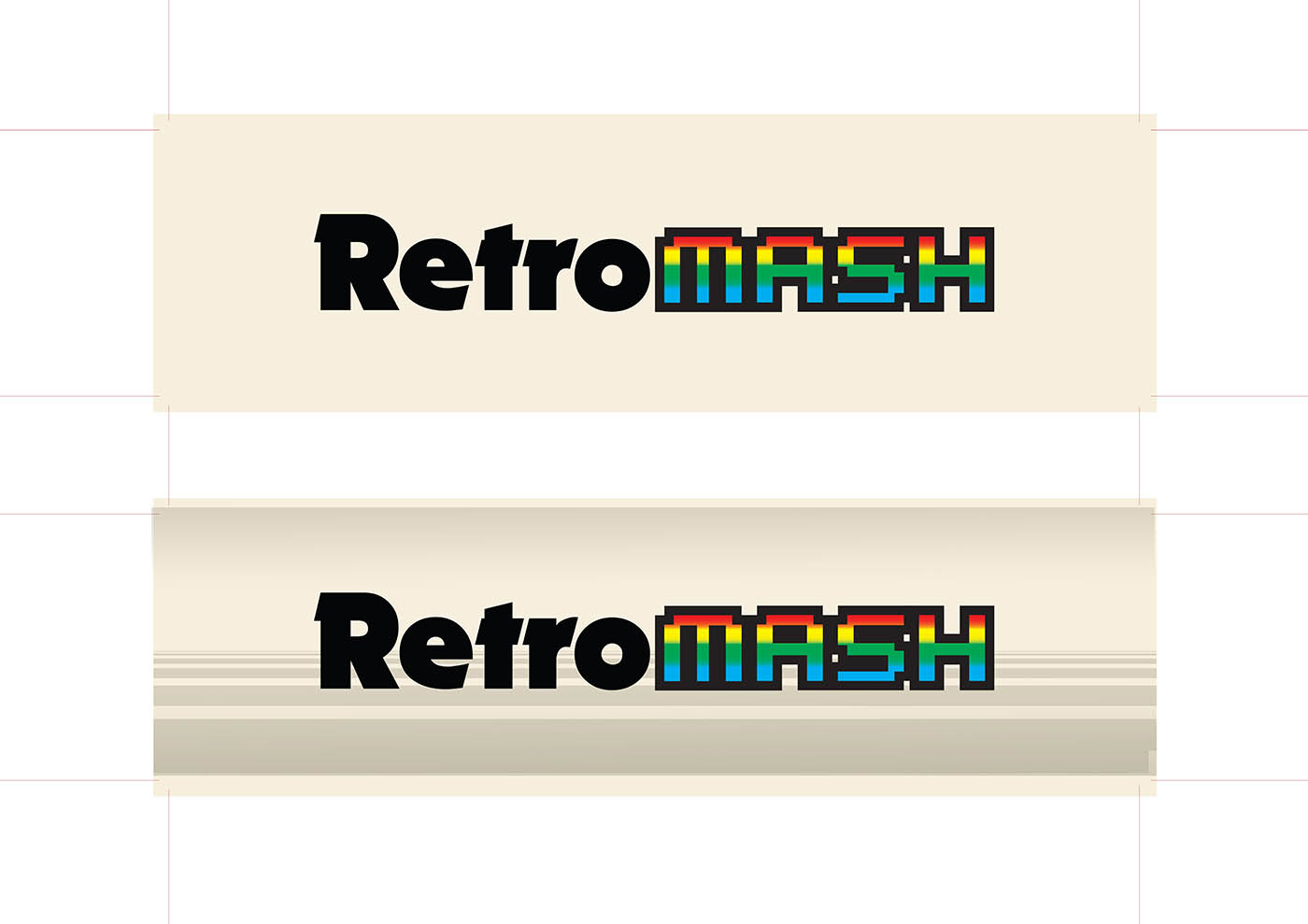
Another bit I struggled on slightly was the marquee art. I knew I wanted the Retromash logo but thought it might be slightly plain just having that. I played around with various 80s horizon styles but in the end just went with a version of the same stripes I had put on the bottom half of the side art. It’s a lot easier to replace the marquee art so I may even do an improved version one day.

Stay tuned for the next post where I talk about ordering and applying the vinyl.
Here’s a list of all the posts about my arcade build.
Part 1
Part 2 – Decisions
Part 3 – Cabinet Design
Part 4 – Control Panel Plans
Part 5 – Initial Questions and Concerns
Part 6 – Online Resources
Part 7 – Cabinet Plans
Part 8 – Buying and Cutting the Wood
Part 9 – Tools and Materials
Part 10 – Building the Cabinet
Part 11 – Building the Control Panel
Part 12 – Sanding and Painting
Part 13 – The Coin Door
Part 14 – Artwork
Part 15 – Printing and Applying the Vinyl
Part 16 – Adding all the T-moulding
Part 17 – The TV Monitor
Part 18 – Making the Bezel
Part 19 – The Marquee
Part 20 – Installing the Electronics
Part 21 – Setting up MAME
Part 22 – Issues to Watch Out For
Part 23 – The Finished Cabinet


Philippe Schartz
Feb 19, 2018 -
Hi,
juste came accross your blog while searching for artworks for my arcade cabinet.
I really love what you did. Is there a cahnce to get the original size vector images you used for your artwork ?
Best Regards from Luxembourg
Philippe
Kieran
Jun 19, 2018 -
Hi,
This atrwork is awesome, such a great look! Like Philippe’s question above, is there any chance you could make the graphics files available?
Great write up by the way its been an inspiration for my own cabinet.
Cheers from Australia,
Kieran
Orlando Vargas
Apr 16, 2019 -
Love the art work consider sharing?
Retromash
Apr 16, 2019 -
Hi Orlando. Thanks for the comments. Unfortunately the artwork is not being shared as I put so much work into it and it’s very personal to me. Everything else such as the plans and designs are all free for anyone to use. But I kind of like my cab being the only one with this particular artwork. Thanks. Michael
Frederic
Apr 9, 2022 -
Hello,
I am looking to know how to do some mockup as you did to get an impression of how the colours and the layout of the side art would look on your cabinet.
Could you please tell me what software did you use to make those mockups ? (inkscape?)
Thanks a lot for you help.
Cheers.
Fred
Retromash
Apr 9, 2022 -
Hi Fred. I used Adobe Photoshop. Good luck with your build!
Fredrik Holmqvist
Jan 11, 2024 -
Hi!
I started thinking of building an arcade machine myself and came across your pages. I really appreciate the effort you made to put all the details of your work, thougts on what to think about and so on on the web. It gave me a lot of insigts and helped a great deal during my project, which is now finished. I didn”t think of designing my own side art but you really inspired me, so I did one myself which got really nice. Thanks a lot for all the links to various pages you included, especiallt for the pixel art.
It was great fun to read about and even better to build and play on.
Best regards
Fredrik (Sweden)
Retromash
Jan 12, 2024 -
Hi Fredrik. Amazing! I love hearing stories like this. Thank you so much for taking the time to leave a comment. I would love to see some photos if you are happy sharing. My email is [email protected]
Michael
How to make money from retro games | Retromash
Jul 9, 2025 -
[…] Games When you are familiar with how to get around basic game development, or are willing to learn, making homebrew games on old systems is a surprisingly lively […]