Time Travel can be such a complex beast that sometimes it’s handy to have it visualised in a more graphical way. Infographics are a great way of representing data and there are some very cool ones about time travel. I’ve put links in the text before each graphic to see them in more details on their original websites.
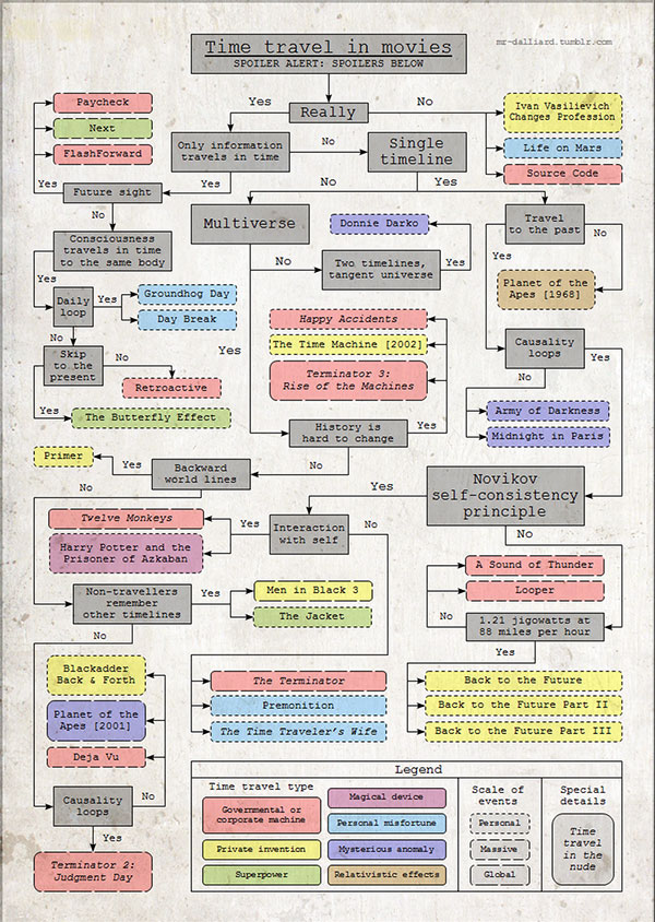
This first one is a great example from Mr Dalliard including overarching time travel questions to help see what categories the films sit in.
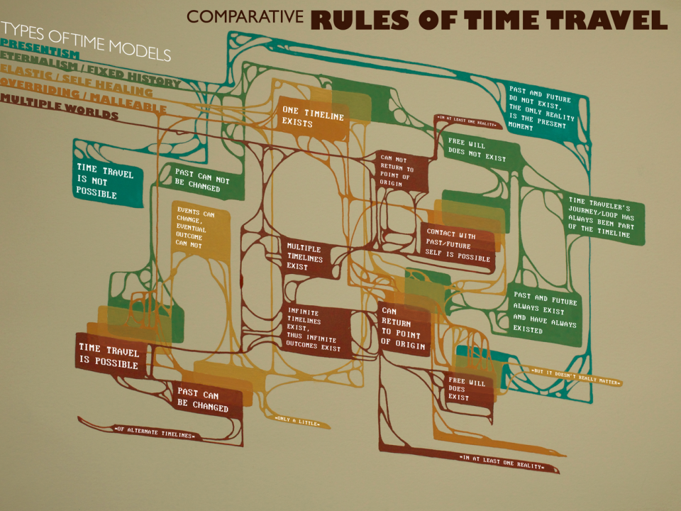
The next one I found on Shana Siegel Art and it attempts to classify different rules of time travel into genres or philosophies.
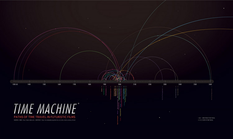
I really like the design of this movie time travel timeline infographic on Visual.ly. You’ll have to click on the link to view it properly at hi-res.
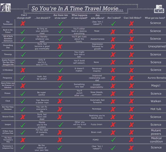
If you prefer your graphics in the form of a checklist then this time travel movie checklist on MTV might be your cup of tea.
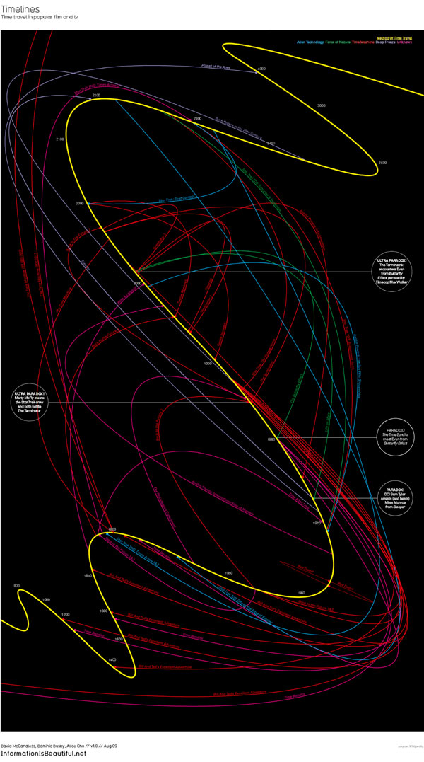
Now, if you are a fan of infographics you probably know all about the amazing book Information is Beautiful, and the new Knowledge is Beautiful
, made by the retro gaming legend that is David ‘Macca’ McCandless. He’s done a fantastic and very complicated time travel movie timeline on his website and even has a page explaining how he made it. Again for this one you will definitely have to click through to the website I linked to, to see the hi-res version.
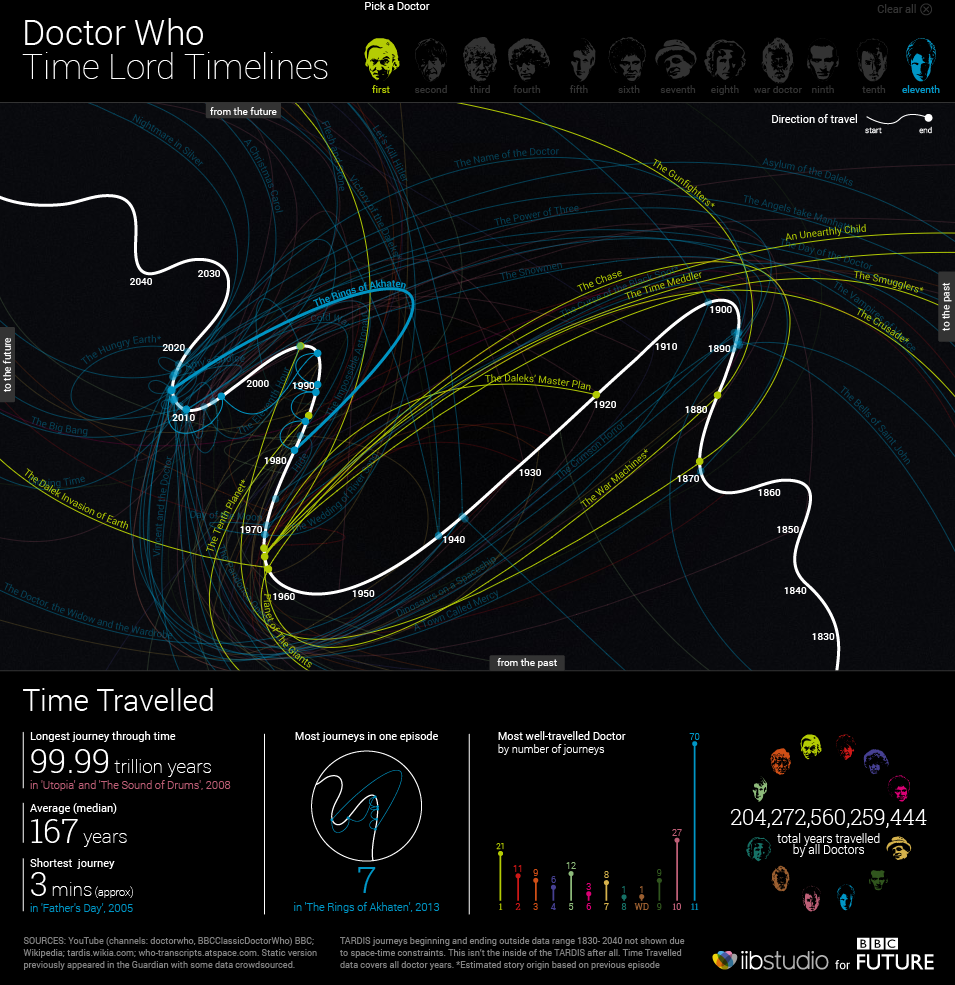
David McCandless also started work on a Doctor Who data set where he crowdsourced a lot of the research to build a data set of all the times that Doctor Who travelled through time.
If you’re a big Doctor Who fan you will also appreciate this extremely well made interactive infographic of Doctor Who’s Time Lord Timelines by the BBC.
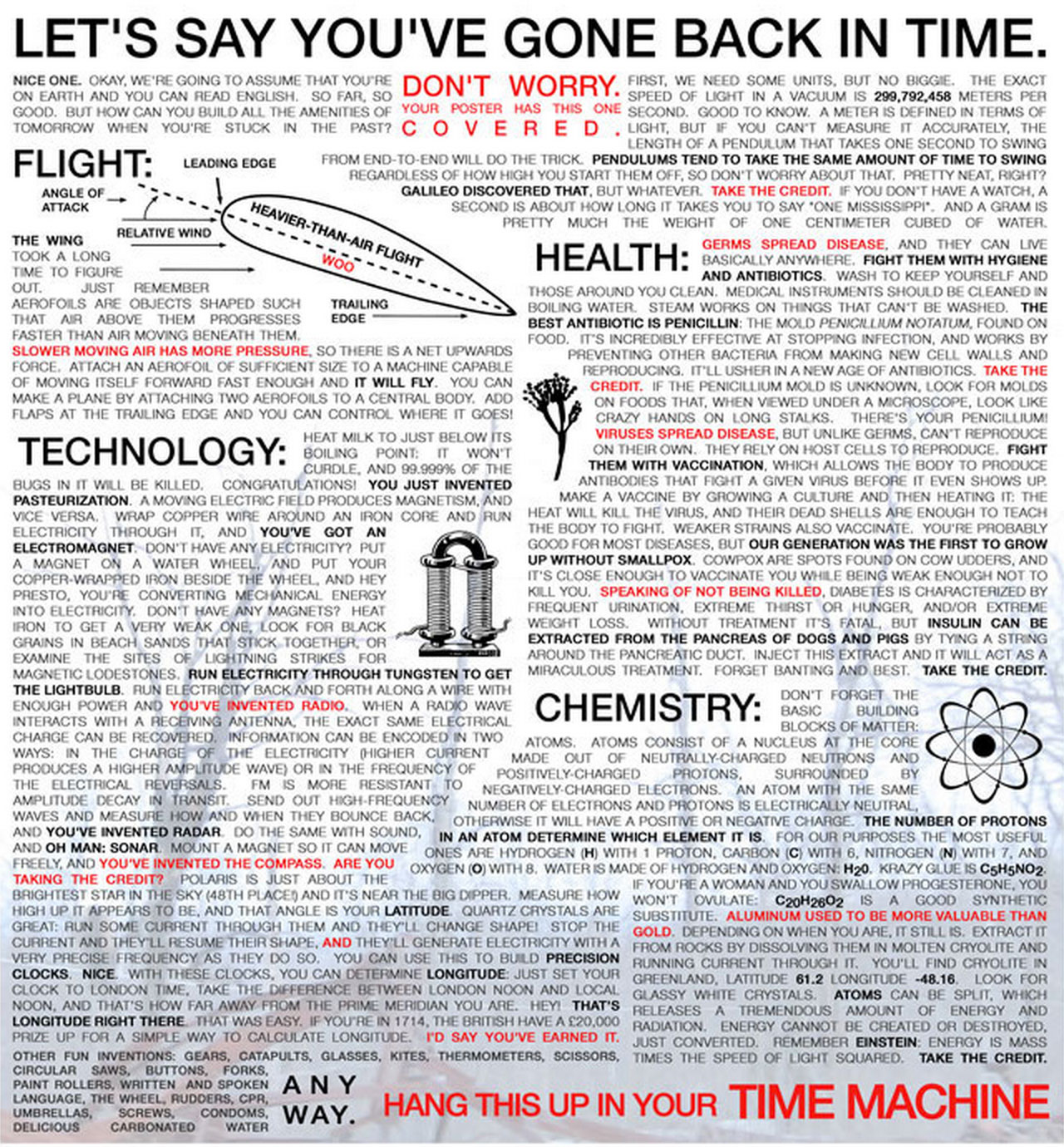
This next one isn’t strictly an infographic but it’s a very useful Time Travel survival aid for anyone who does happen to end up travelling through time. Some very useful info here!
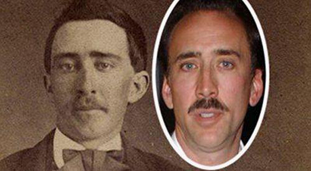
And even though these aren’t infographics I just have to end on this cool visuals of celebrities who could be time travellers!
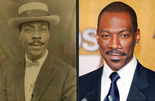
Tune in tomorrow for our final post of #timetravelweek.


Looking for reliable web hosting? Try OuzirHost! Visit https://ouzirhost.com today.
Mar 4, 2025 -
If you have trouble identifying the original Zafran Hair Growth Therapy or the genuine Zafran brand product, you can send a picture of the Zafran Oil or other Zafran brand product you are about to purchase to the Zafran brand’s customer care WhatsApp number (+88)019-05050505. The customer care representative will verify whether the product is original or fake based on the picture you send. Confirm your order or make payment to the seller only after getting confirmation from Zafran brand’s customer care.